


Choosing and Using a Website Hero Image
Author:
Adrian Raath
UI/UX Design
Posted on:
Mar 20, 2023
Mar 20, 2023
Category:
UI/UX Design
UI/UX Design
Choosing a good hero image and using it effectively in your hero section layout is vital for making a good first impression and encouraging user engagement.

The hero section of a web page is the first thing a user sees during a website visit. Once landing, they take all of about 2 - 5 seconds to form their first impressions of your website and your brand. Communicating your key value proposition in a concise, clear manner is therefore extremely important. The image/visual you use to accompany your introductory copy needs to be chosen carefully so that it enhances your message and gives you the best possible chance of having a visitor dig deeper into your website.
What a good hero image does
Your hero section image exists to complement and enhance your value proposition headline and to create visual appeal. Imagine landing on a website in 2022 and not seeing any visuals at first glance. Chances are you are going to skip over that site pretty quickly and look for something that does a better job of grabbing your attention.
A good hero section image works in tandem with headline copy to create a hook, pull the user in and encourage them to scroll down or click on a link to see what the website has to offer.
Example time:
Take this hero section below for instance.

Speaking in terms of UX best practice, it actually does a lot of things right; it communicates the offering clearly and concisely, highlights benefits immediately and has a strong call to action. All that said though, its boring and dull, and most people would probably hit the close tab button or change sites as soon as they see this. There is nothing here to stimulate the visual senses of the visitor, and that is a problem.
The solution:
Luckily, fixing a section like this is relatively simple.
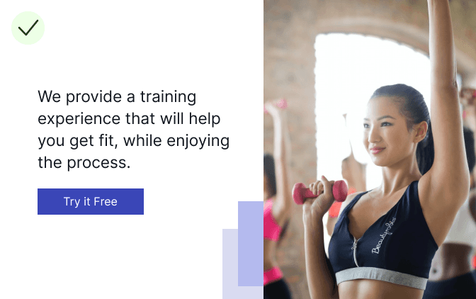
By simply adding an image (and a small set of blue blocks bottom left of it) we have created some visual appeal without detracting from the headline copy at all. In fact, the image actually strengthens and reaffirms the message communicated through the headline.
Adding an image to this website hero achieves the following:
Creates a source of visual stimulation to engage the user
“Put your money where your mouth is” by backing up your offering with relevant imagery
A good hero image supports your value proposition and plays an important role in captivating the user on first load. It should always be relevant to the service/product you are communicating and should never detract from your headline copy. And that brings us to the next point.
What a good hero image does not do
While it is true that a good hero image can add massive perceived value to a visitor’s first impression of your website, a badly selected one can do just as much, if not more damage. A good hero image never distracts the visitor from or distorts the most important element on the screen: The headline copy that introduces your offering.
A good hero image supports your headline copy. It doesn’t compete with it.
Example time:
Take the hero section example below, where the background image used is more prominent than the headline copy.

In this case, the image may be of high quality and relevant to the service being offered, but the way it has been utilized makes the headline copy very difficult to read. That’s a big problem as now you will be eating into the precious first few seconds of someone being on your site with them squinting at your headline, trying understand what you have to offer. Only the most patient of visitors are actually going to give you this time. The rest will bounce.
The solution:
Luckily, this is an easy problem to fix.
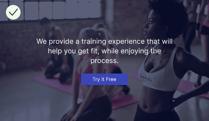
By giving the image a dark blue, semi-opaque overlay we can give the headline far more contrast and deemphasize the details of the image itself. All-in-all, this gives you the best of both worlds. Your headline copy is clearly readable due to the image being less prominent but the image is still supporting the headline semantically and adding value accordingly.
Readability of your headline comes first. Always. Position or style your hero section in a way that it allows your headline to be clearly readable.
How to Choose the Right Hero Image
So with the do’s and don’ts of hero images in mind, how does one actually select and utilize a good hero image for their website. I have broken down a simple process below to get you started.
1 - Let your value proposition guide you
This sounds incredibly esoteric so let me clarify. Your hero section should have semantic relevance to your headline copy. And your headline copy should be communicating the message you want people to see as they land on your site. Take some time to browse stock libraries and select an image carefully. It will go a long way in improving customers’ first impression of your site if you manage to select a strong one.
Don’t pick an image because it looks cool. Pick one because it supports and enhances the message you are trying communicate
2 - Decide how to position the Image
Depending on the orientation and visual details of your image, it will suit or not suit certain hero section layout styles. There are so many styles and orientations of images to cover here but I am only going to illustrate the most common two as they account for the majority of hero images on the web. These being portrait images and landscape images.
Using portrait images in a hero section:
A portrait image is taller than it is wide. It is thus not suited to fill the entire background of a hero section as it will result in the image looking “blown up”, potentially pixelated and distorted. Portrait photos are perfect for what I like to call “left/right hero’s” whereby you have your headline and call to action on one side of the screen and a supporting image on the other.
Example time:
The example below gives you an idea of what a hero section using this approach could look like.
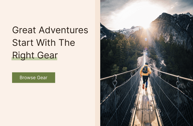
The portrait image above allows us to create a clear separation between headline and image. This is an easy to implement, highly effective layout style as it provides a balance between headline readability and visual appeal.
Using landscape images in a hero section:
A landscape image is one where width is greater than height. Landscape images are great for hero section backgrounds that cover the entirety of the section, with content sitting on top. There are two main types of landscape images used in hero sections; those with a subject that spans the entire image/is central to the image and those where the subject is off to one side. The best way to understand this is to see examples and I have included one of each below.
Using landscape images in a hero section (with subject centered):
These are images that have a subject that is in the center of the image or a subject that spans the entire image. The subject refers to the main area of interest in an image. For instance, for an image that shows a group of three colleagues talking, the subject would be the three people. This type of landscape image is best suited to a layout that makes use of central headline text and call to action with the image itself deemphasized. This allows the headline copy and call to action sitting on top to be as readable as possible.
Example time:
Have a look at the example below for an idea of what a hero section using this image style could look like.

There are a few things that make this style of hero image effective. Firstly, you don’t have to be too finnicky about the image you choose so you can go with your gut. The image is going to be deemphasized anyway in order to bring the headline copy to the front and create contrast. This approach brings headline copy front and center, ensuring that visitors see and read your value proposition immediately as they land on your site. Lastly, designing and developing a layout like this is quick and easy and takes minimal design or technical expertise to pull off.
Using landscape images in a hero section (with subject to one side)
These are landscape images that have the main subject aligned to one side of the image, with the rest of the image being fairly “visually quiet” and featureless. These images are perfect for a hero section with text and call to action aligned to one side of the layout with the image subject aligned to the other. This allows the image subject and the headline to occupy their own space on the page, preventing them from competing with one another for attention.
Example time:
Have a look at the example below for an idea of what a hero section using this image style could look like.
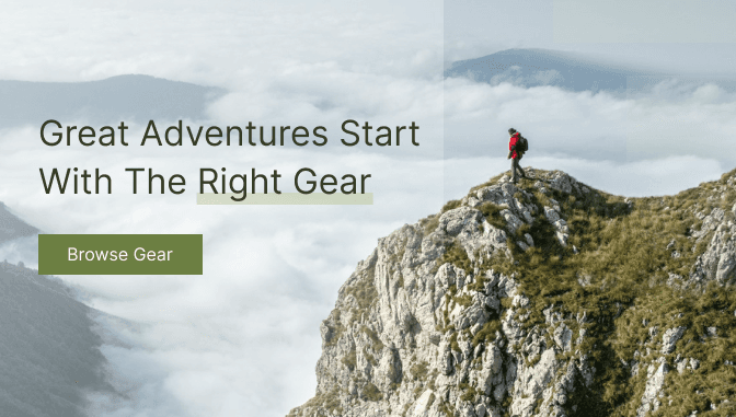
I am a big fan of this approach as I find it to be the one that draws the most attention, if setup correctly. Analyzing the example above, the left hand side is made up of clouds and not much else. This means that when we place headline text on top of it, it is clearly readable as it doesn’t have details to compete with in the background. Using a subtle gradient over the side containing text is a great way to improve text readability further without deemphasizing the image too much. The right hand side of the layout contains the image subject, clearly visible and complementing the headline copy.
3 - Test it on Real People
At the end of the day, you are trying to design a hero section that will appeal to the needs and desires of your target audience so that they are captivated immediately, and will thus venture deeper into your website. As someone responsible for designing this section, the best you can do is use the information you have available about your audience, and create something you think they will like. There is no guarantee, even if you apply all of the guidelines above, that what you create will have the desired impact on them and that is exactly why you need to test!
Once you have a hero concept together, show it to people and get some unbiased feedback. Don’t guide them in any specific direction, simply ask them to give you their first impressions of overall perceived quality and what they think your product/offering is based on the hero section they are looking at.
Look out for comments such as the following:
“I can’t really read the headline properly”
“The image is confusing because it doesn’t seem relevant”
“The image is blurry”
Of course, these are just a few comments you may receive so be on the lookout for others. If you notice common trends in feedback, it means you should probably address the relevant aspect(s) of your design and make changes accordingly. Once you have made them, test again and rinse and repeat until you have something that the vast majority of your testing pool responds positively to.
Closing Thoughts
Always prioritize readability of your headline. If you have made it this far you will have picked up that in all concepts explained and examples shown, hero images are positioned as secondary content, there to complement and enhance the value proposition communicated in your headline. Your image should never compete with or detract from the readability of your headline. If it does, visitors will get frustrated and leave, as your offering will be too difficult to see and understand. Despite being secondary content, your hero image still has great importance! Without an attractive visual to accompany your headline, your hero section is unlikely to draw the attention of your visitors. This may well cause them to leave without even bothering to discover what it is you could offer them.
Hopefully the insights and examples contained in this piece help you strike the balance between headline and image, resulting in a hero section that engages your audience and encourages them to take action.
The hero section of a web page is the first thing a user sees during a website visit. Once landing, they take all of about 2 - 5 seconds to form their first impressions of your website and your brand. Communicating your key value proposition in a concise, clear manner is therefore extremely important. The image/visual you use to accompany your introductory copy needs to be chosen carefully so that it enhances your message and gives you the best possible chance of having a visitor dig deeper into your website.
What a good hero image does
Your hero section image exists to complement and enhance your value proposition headline and to create visual appeal. Imagine landing on a website in 2022 and not seeing any visuals at first glance. Chances are you are going to skip over that site pretty quickly and look for something that does a better job of grabbing your attention.
A good hero section image works in tandem with headline copy to create a hook, pull the user in and encourage them to scroll down or click on a link to see what the website has to offer.
Example time:
Take this hero section below for instance.
Speaking in terms of UX best practice, it actually does a lot of things right; it communicates the offering clearly and concisely, highlights benefits immediately and has a strong call to action. All that said though, its boring and dull, and most people would probably hit the close tab button or change sites as soon as they see this. There is nothing here to stimulate the visual senses of the visitor, and that is a problem.
The solution:
Luckily, fixing a section like this is relatively simple.
By simply adding an image (and a small set of blue blocks bottom left of it) we have created some visual appeal without detracting from the headline copy at all. In fact, the image actually strengthens and reaffirms the message communicated through the headline.
Adding an image to this website hero achieves the following:
Creates a source of visual stimulation to engage the user
“Put your money where your mouth is” by backing up your offering with relevant imagery
A good hero image supports your value proposition and plays an important role in captivating the user on first load. It should always be relevant to the service/product you are communicating and should never detract from your headline copy. And that brings us to the next point.
What a good hero image does not do
While it is true that a good hero image can add massive perceived value to a visitor’s first impression of your website, a badly selected one can do just as much, if not more damage. A good hero image never distracts the visitor from or distorts the most important element on the screen: The headline copy that introduces your offering.
A good hero image supports your headline copy. It doesn’t compete with it.
Example time:
Take the hero section example below, where the background image used is more prominent than the headline copy.
In this case, the image may be of high quality and relevant to the service being offered, but the way it has been utilized makes the headline copy very difficult to read. That’s a big problem as now you will be eating into the precious first few seconds of someone being on your site with them squinting at your headline, trying understand what you have to offer. Only the most patient of visitors are actually going to give you this time. The rest will bounce.
The solution:
Luckily, this is an easy problem to fix.
By giving the image a dark blue, semi-opaque overlay we can give the headline far more contrast and deemphasize the details of the image itself. All-in-all, this gives you the best of both worlds. Your headline copy is clearly readable due to the image being less prominent but the image is still supporting the headline semantically and adding value accordingly.
Readability of your headline comes first. Always. Position or style your hero section in a way that it allows your headline to be clearly readable.
How to Choose the Right Hero Image
So with the do’s and don’ts of hero images in mind, how does one actually select and utilize a good hero image for their website. I have broken down a simple process below to get you started.
1 - Let your value proposition guide you
This sounds incredibly esoteric so let me clarify. Your hero section should have semantic relevance to your headline copy. And your headline copy should be communicating the message you want people to see as they land on your site. Take some time to browse stock libraries and select an image carefully. It will go a long way in improving customers’ first impression of your site if you manage to select a strong one.
Don’t pick an image because it looks cool. Pick one because it supports and enhances the message you are trying communicate
2 - Decide how to position the Image
Depending on the orientation and visual details of your image, it will suit or not suit certain hero section layout styles. There are so many styles and orientations of images to cover here but I am only going to illustrate the most common two as they account for the majority of hero images on the web. These being portrait images and landscape images.
Using portrait images in a hero section:
A portrait image is taller than it is wide. It is thus not suited to fill the entire background of a hero section as it will result in the image looking “blown up”, potentially pixelated and distorted. Portrait photos are perfect for what I like to call “left/right hero’s” whereby you have your headline and call to action on one side of the screen and a supporting image on the other.
Example time:
The example below gives you an idea of what a hero section using this approach could look like.
The portrait image above allows us to create a clear separation between headline and image. This is an easy to implement, highly effective layout style as it provides a balance between headline readability and visual appeal.
Using landscape images in a hero section:
A landscape image is one where width is greater than height. Landscape images are great for hero section backgrounds that cover the entirety of the section, with content sitting on top. There are two main types of landscape images used in hero sections; those with a subject that spans the entire image/is central to the image and those where the subject is off to one side. The best way to understand this is to see examples and I have included one of each below.
Using landscape images in a hero section (with subject centered):
These are images that have a subject that is in the center of the image or a subject that spans the entire image. The subject refers to the main area of interest in an image. For instance, for an image that shows a group of three colleagues talking, the subject would be the three people. This type of landscape image is best suited to a layout that makes use of central headline text and call to action with the image itself deemphasized. This allows the headline copy and call to action sitting on top to be as readable as possible.
Example time:
Have a look at the example below for an idea of what a hero section using this image style could look like.
There are a few things that make this style of hero image effective. Firstly, you don’t have to be too finnicky about the image you choose so you can go with your gut. The image is going to be deemphasized anyway in order to bring the headline copy to the front and create contrast. This approach brings headline copy front and center, ensuring that visitors see and read your value proposition immediately as they land on your site. Lastly, designing and developing a layout like this is quick and easy and takes minimal design or technical expertise to pull off.
Using landscape images in a hero section (with subject to one side)
These are landscape images that have the main subject aligned to one side of the image, with the rest of the image being fairly “visually quiet” and featureless. These images are perfect for a hero section with text and call to action aligned to one side of the layout with the image subject aligned to the other. This allows the image subject and the headline to occupy their own space on the page, preventing them from competing with one another for attention.
Example time:
Have a look at the example below for an idea of what a hero section using this image style could look like.
I am a big fan of this approach as I find it to be the one that draws the most attention, if setup correctly. Analyzing the example above, the left hand side is made up of clouds and not much else. This means that when we place headline text on top of it, it is clearly readable as it doesn’t have details to compete with in the background. Using a subtle gradient over the side containing text is a great way to improve text readability further without deemphasizing the image too much. The right hand side of the layout contains the image subject, clearly visible and complementing the headline copy.
3 - Test it on Real People
At the end of the day, you are trying to design a hero section that will appeal to the needs and desires of your target audience so that they are captivated immediately, and will thus venture deeper into your website. As someone responsible for designing this section, the best you can do is use the information you have available about your audience, and create something you think they will like. There is no guarantee, even if you apply all of the guidelines above, that what you create will have the desired impact on them and that is exactly why you need to test!
Once you have a hero concept together, show it to people and get some unbiased feedback. Don’t guide them in any specific direction, simply ask them to give you their first impressions of overall perceived quality and what they think your product/offering is based on the hero section they are looking at.
Look out for comments such as the following:
“I can’t really read the headline properly”
“The image is confusing because it doesn’t seem relevant”
“The image is blurry”
Of course, these are just a few comments you may receive so be on the lookout for others. If you notice common trends in feedback, it means you should probably address the relevant aspect(s) of your design and make changes accordingly. Once you have made them, test again and rinse and repeat until you have something that the vast majority of your testing pool responds positively to.
Closing Thoughts
Always prioritize readability of your headline. If you have made it this far you will have picked up that in all concepts explained and examples shown, hero images are positioned as secondary content, there to complement and enhance the value proposition communicated in your headline. Your image should never compete with or detract from the readability of your headline. If it does, visitors will get frustrated and leave, as your offering will be too difficult to see and understand. Despite being secondary content, your hero image still has great importance! Without an attractive visual to accompany your headline, your hero section is unlikely to draw the attention of your visitors. This may well cause them to leave without even bothering to discover what it is you could offer them.
Hopefully the insights and examples contained in this piece help you strike the balance between headline and image, resulting in a hero section that engages your audience and encourages them to take action.