Broadview Capital Hero
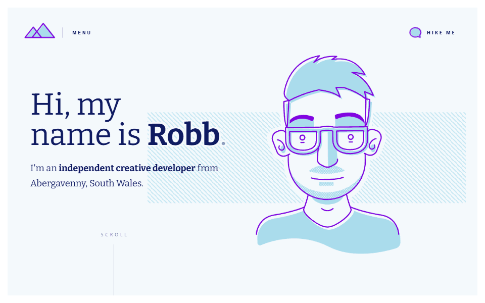
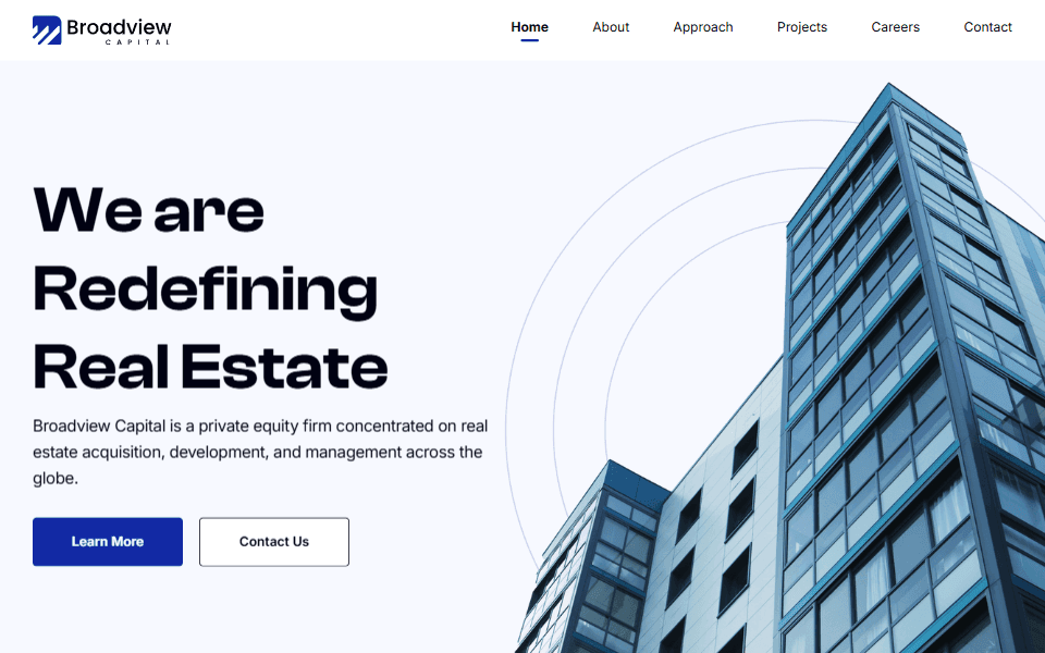
Classic left/right hero section with clear typography and an image relevant to the offering.
Why I like it:
1
Bold, easy-to-read title immediately establishes value and relevance.
2
Clear primary and secondary calls to action above the fold.
3
Imagery creates visual interest but doesn't compete with text on the left.


