Cuberto Hero
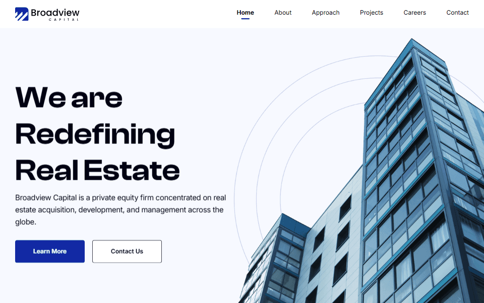
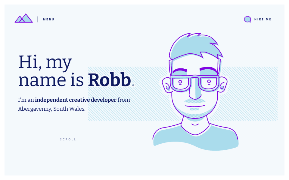
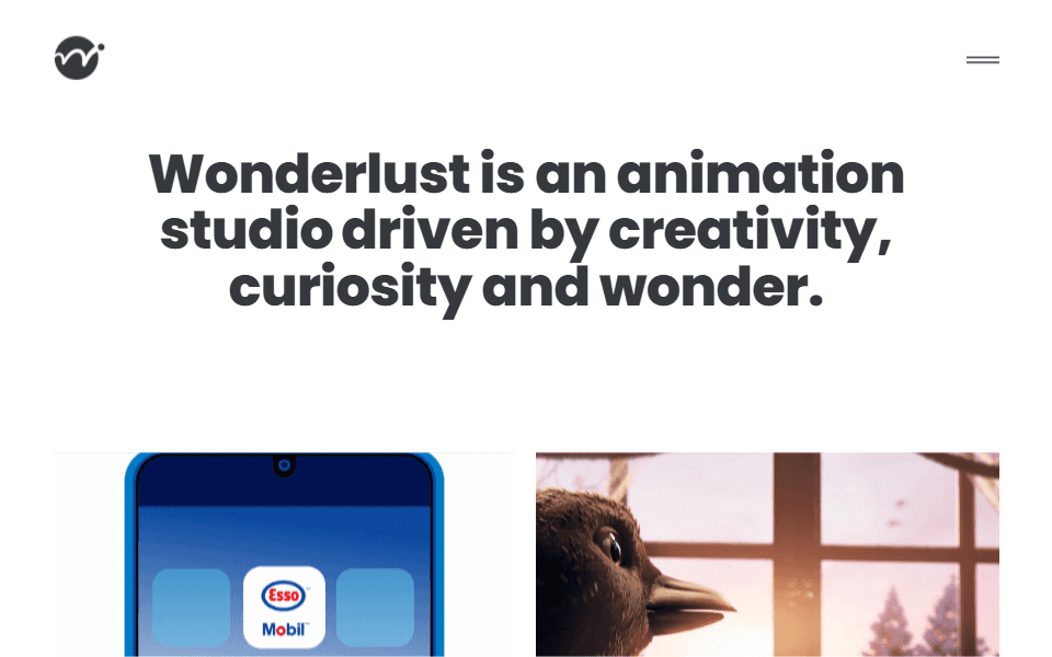
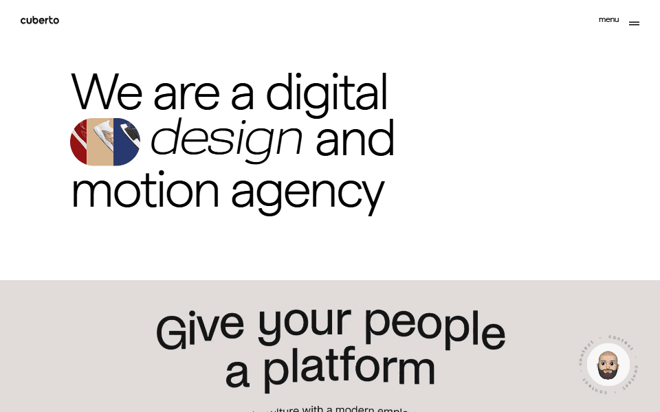
Clean, simple hero section with bold typography and an interesting, animated grapchic in the title.
Why I like it:
1
Lovely, bold typography grabs the eye immediately. This is further enhanced by a subtle animated graphic.
2
Very clear, simple message lets the user know what the brand offers without any need for interpretation.
3
Plenty whitespace makes for a harmonius, uncluttered look and feel.


