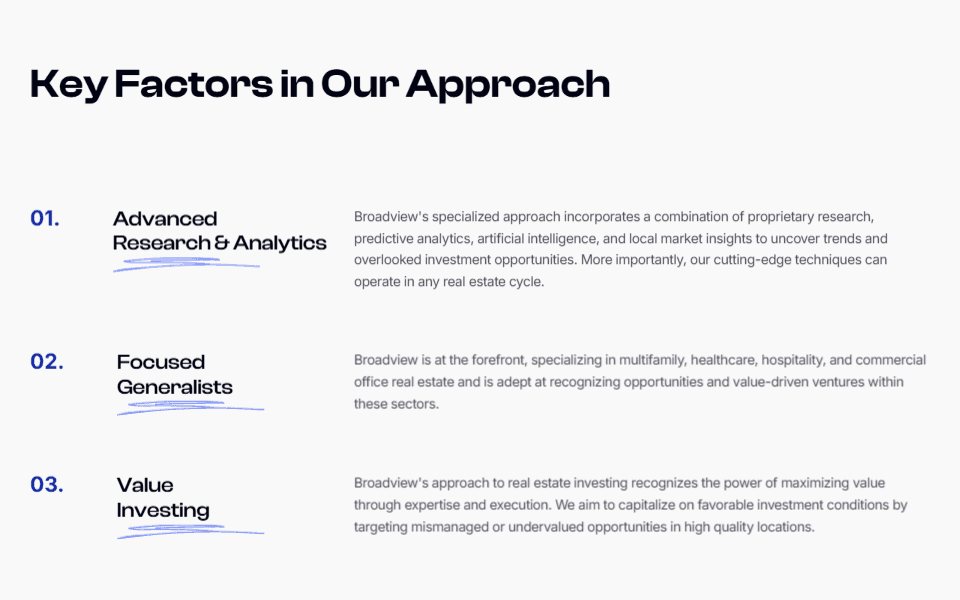
Refokus Client Features
Simple but effective section, clearly differentiating the brand's offering to their two main target markets.
![](https://framerusercontent.com/images/LRyZqb26jiEbYVvukfTdEXvOcUQ.png)
Why I like it:
1
Simple white on black color scheme and no other color usage helps maximize readability.
2
Showing a logo list for each respective section does a great job of adding trust and credibility.
3
A simple, symmetrical grid layout helps create order, clear information hierarchy and symmetry.