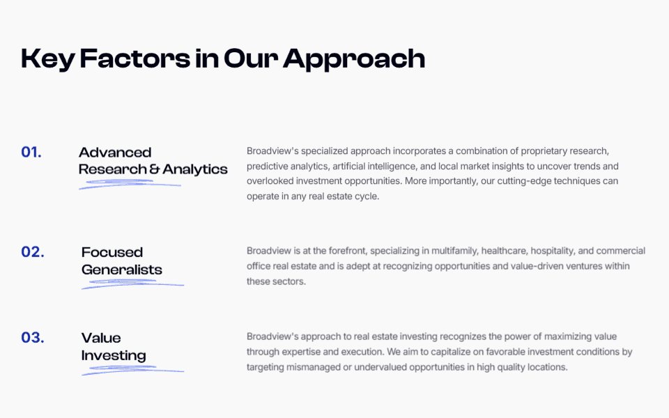
Refokus Hero
An incredible hero section making use of bold typography, a clear value proposition and an awesome mouse-over hover effect (go and check it out on their site!)
![](https://framerusercontent.com/images/dj3rcnLZFgZ3nDQQnWzOfIAtkg.png)
Why I like it:
1
Title is bold and clear. I also like how they have used the recognizable Webflow branding to pull potential clients in and immediately be perceived as relevant.
2
White, black, purple color scheme works well and color usage overall is well balanced.
3
The hover over effect on the title shows off their Webflow skills very effectively. Do yourself a favor and go and check it out on their site.